II
II. Introduction to
the RedRak Interface
Here is a brief overview of the RedRak interface to get you started using your RedRak.
A. The RedRak Tutorial
You can experience an interactive demonstration of the RedRak interface through
the RedRak Tutorial. Select Tutorial on the RedRak Personal Hotlinks page, or click
the RedRak logo in the upper left corner of the Command Panel (red upper section
of your RedRak screen) on almost any RedRak interface page and then click on Tutorial.
Although some of the examples presented in the tutorial are for demonstration
purposes only and will not function exactly as they would in an active RedRak session,
the Tutorial is an excellent way to get started.
B. The RedRak Interface
Here is a brief overview of the RedRak interface to get you started using your
RedRak. The RedRak Interface
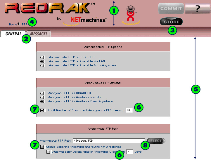
 Command panel - Controls in this area affect the entire "page" in the Input Panel.
 Tabs - Use these to switch back and forth between a series of pages. The current
tab in use is white. Other available tabs are darker. Some tabs are required and
others are optional; an error message will let you know if you must enter information in
a tab before you can move on.
 Buttons - Use these to complete a task and move from page to page.
- COMMIT - None of your changes are actually made until you commit them.
For more on the commit process, see "Committing Changes" under "Overview"
in the online help. The COMMIT button is not always available and may
appear grayed out if it is not possible to perform a commit on the current page.
This button only appears when a user logs on with administrator privileges.
- These buttons are located below the COMMIT button. Only one may appear
at any time. Which button is made available depends upon the context of
the current page.
- SELECT - Tells RedRak that you would like to accept your selection and return
to a previous page. (To have RedRak ignore your selection and return to
a previous page, click the previous page in the Navpath [item {4} in this chapter]).
Do not use the back button in your browser.)
- RETURN - The RETURN button has a similar function to the SELECT button.
The SELECT and RETURN buttons point left because they return you to a
previous page.
- STORE - On some pages, the SELECT or RETURN buttons will be replaced
by STORE. STORE means: (1) you are saving the changes on the current
page temporarily, and (2) the changes are in the commit queue and
will become permanent after you click the COMMIT button. This button only appears when
a user logs on with administrator privileges. (To have RedRak ignore your
selection and return to a previous page, click the previous page in the
Navpath, described in the next item, below. Do not use the back button in your browser.)
- OK! - This performs an immediate system change, such as setting the clock,
or changing a password. These changes do not require a commit. (To have
RedRak ignore your selection and return to a previous page, click the previous
page in the Navpath, described in the next item, below. Do not use the back
button in your browser.)
- CONTINUE (green) - Continue to the next page.
- CONTINUE (yellow) - Continue to the next page with caution because
a significant system change will occur. For example, this will be seen
when deleting files.
-
 View context-sensitive online help.
�
 Navpath - Use the Navpath to navigate around RedRak software, rather than
using your browser's back button. This is because the back button and Navpath do
not work the same way.
The Navpath (short for Navigation Path) has three main functions:
- It shows you where you are and how you got there.
- It allows you to return to previous pages.
- It lets you cancel any changes you made on the current page.
�Facts about navpath:
- The Navpath is oriented from left-to-right in the same sequence you used to
get from page to page. The left is the start of the path and the right is the end.
- Any steps in the path which are underlined indicate that they are links and
you may return to them from the current page. (Note: Internet Explorer (4.x)
and Netscape Navigator (4.x) offer the user the option of disabling underlining
to distinguish text links. If you have this feature switched on, you will not see
the underlining.)
- The current page is at the end of the path. The current page is not underlined.
- The first step in the path will always be home. The remaining steps will
always be the three most recent pages. An ellipsis (...) indicates there are more
pages in your path to return to the home page.
- Returning to the previous page in a Navpath accomplishes two things: it
returns you to the previous page, and it cancels any changes you made or editing
you did to the information on the current page. As you move your cursor over
the arrows, they will change from black to red to indicate a Cancel.
- If you want to return to an earlier page but it is not available from the
navpath, you must first click either SELECT,
OK, or STORE, or go to a previous
page, which will cancel what you have entered on the current page.
�
 Input Panel - New and edited information is displayed here in various forms,
such as:
 textboxes
 checkboxes
 a choice of a textbox or select button
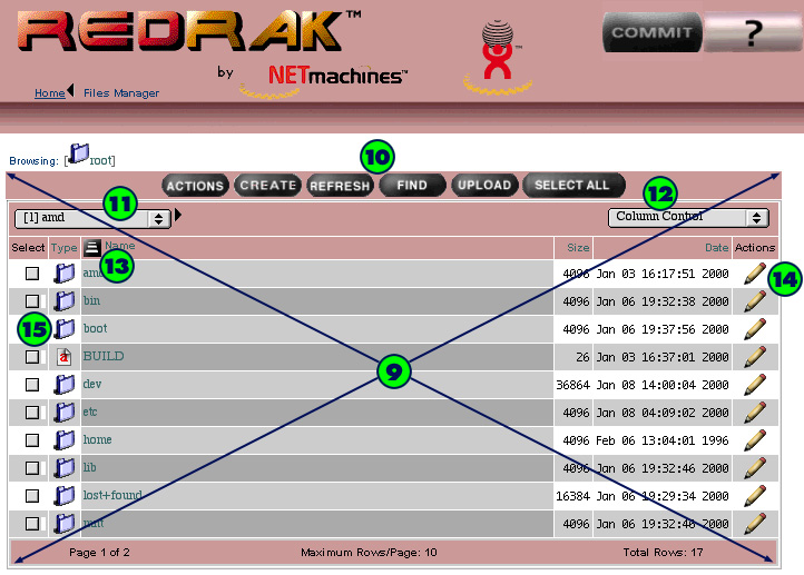
 A table. Features include:
 Table Header buttons - These buttons, such as
ACTIONS or CREATE pertain to the entire list and are context-sensitive.
 Paging Control - Use the Paging Control to modify the number of table
rows displayed at once. All Shown tells you that all rows are displayed. Select from
the following options:
Shorter: Makes a long list shorter five rows at a time.
Longer: Makes a short list longer five rows at a time.
Reset: Resets to the default length of ten rows per page.
 Column Control - Use the Column Control to show or hide table columns.
This works similar to Paging Control.
 Sort - This button sorts the rows. The column heading with the sort
button indicates the column by which the information in the list is sorted. Clicking
on the name of any other column will switch the list to sort by that column.
Clicking on the sort button switches between ascending and descending
order for the list:
 Indicates rows are in ascending order (ABC or 123); click to switch
order to descending.
 Indicates rows are in descending order (ZYX or 321); click to
switch order to ascending.
 Actions - Click on the icons in this column to perform an action. Each
table contains a subset of these following actions:
 Edit the item on this row
 Delete the item on this row
 Edit LDAP information
 Move item to top of list
 Move item up one row in list
 Move item down one row in list
 Add Item to list
 Cancel this entry
 Show more information about the row's item
 Confirm changes to a row's inputs during edit
 Fix item. Appears only in Home|Reports|System Check.
 Icons before a table item - These items represent different types of information.
Run the mouse over an icon to display a description of what will happen if
you click on the icon. For example,
  indicates a device is being shared.
Running your mouse over the Device icon would display
Browse this device in the status bar of your browser.
If the device is currently inactive or disabled, the description icon will have an
X through it.
Other icon definitions are listed below:
 Shared Path, Hotlinks Folder, Folder within Files Manager
 Inactive Shared Path (This path has been stored but not yet committed.)
Next
Chapter | Table of
Contents


![]() textboxes
textboxes
![]() checkboxes
checkboxes
![]() a choice of a textbox or select button
a choice of a textbox or select button

![]() Shared Path, Hotlinks Folder, Folder within Files Manager
Shared Path, Hotlinks Folder, Folder within Files Manager
![]() Inactive Shared Path (This path has been stored but not yet committed.)
Inactive Shared Path (This path has been stored but not yet committed.)